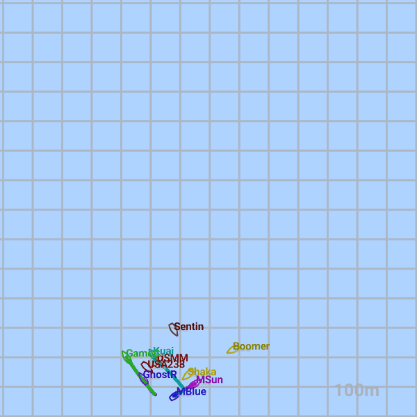
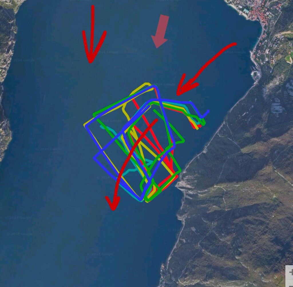
Race Area Location
A race area map is provided with an arrow showing the average wind direction for the race. When applicable, additional markings illustrate wind or current features based on race analytics.
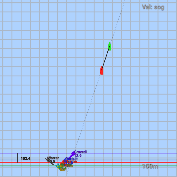
Start Line Data
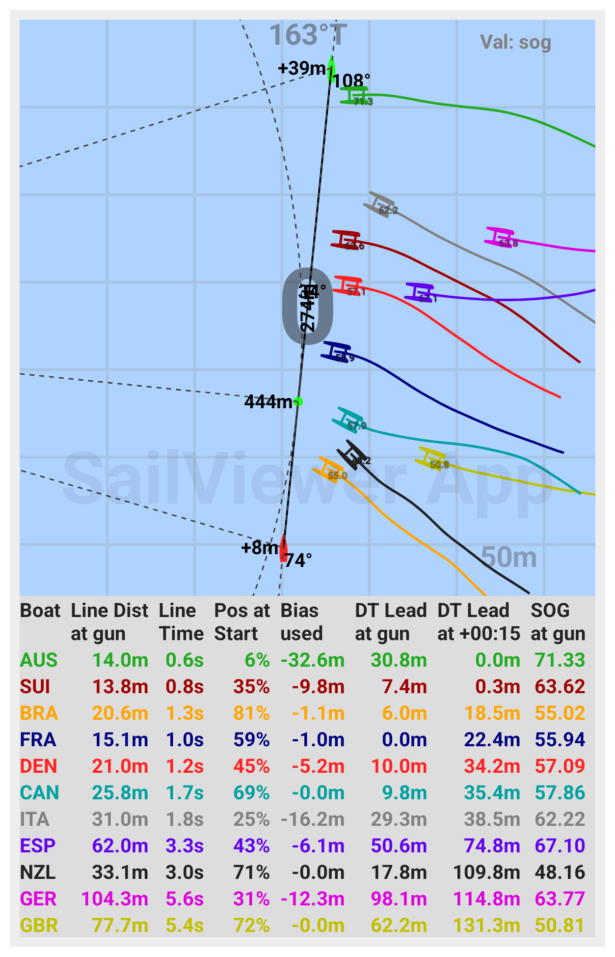
Start Line Screen
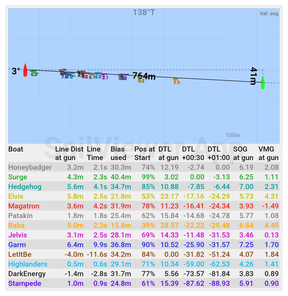
Start Line Data Overview
The start line data visualizes the line, including its length and bias. The wind direction displayed is the app’s suggested value for the first few minutes of sailing, derived from the boats’ tracks after the start.
The other fields are described as follows:
• Line Dist at Gun: The distance to the start line at the gun. Negative values indicate the boat was over the line at the start. Note it is distance between the tracking device and the line.
• Line Time: The time when the line was crossed. Negative values indicate crossing too early.
• Pos at Start: Position at the line; 0% represents fully at the RC (Race Committee) side, and 100% represents fully at the Pin side.
• Bias Used: The amount of bias used when crossing the line. If you start at the favored end, you are using the maximum available bias.
• DT Lead at Gun at 1:00: The upwind distance to the leading boat at the gun and after one minute of racing.
• SOG at the Gun: The speed over ground at the gun.
Start Line Data Disclamer
The positions at the gun in table are shown from the actual device position. If they show just a small distance behind the line, the boat was most probably over the line. On all the drawings, device is placed in the middle of the hull. The hull shapes are not accurate per class, but are approximate. Since the boats can travel significant amount of space between the two GPS fixes, the app is estimating the position at the gun by interpolation. So even though the positions are pretty accurate, they are not 100% sure.
The black dots represent the positions of the boats at specific times before the start and at the moment of the start.
Start Line Ends
The start line is determined based on how the information was provided.
If the start line was set using pings received with the logs from the sailing teams, keep in mind that these pings are taken at different locations and can sometimes be inaccurate. Many teams set these pings conservatively. Additionally, the start line ends can move as the boats swing around their anchors. In the worst-case scenario, such as when there is a current against the wind, even a slight difference in wind speed can cause the start line boat to drift significantly from its anchor position.
If the start line is not provided, the best possible approximation is used based on the available information (e.g., which boats were over the line, video footage of the start, etc.). However, this approximation may not always be perfectly accurate.
If the positions of the RC (Race Committee) and pin end were also logged, then the start line would be more precise, as their exact positions at the start would be used. This same accuracy applies to starts managed by the RaceSense system by Vakaros.
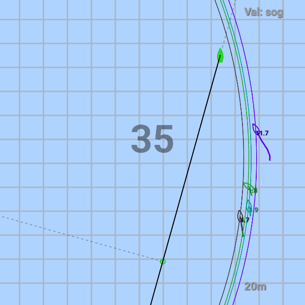
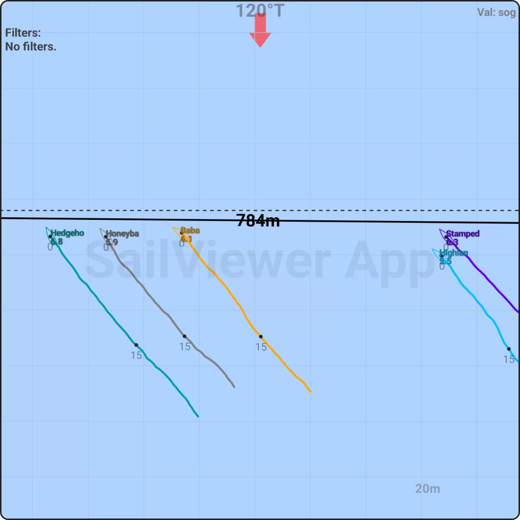
Reaching Starts
For reaching starts, a green dot is added to indicate the closest point to mark 1. A dashed line extends from this point toward mark 1. On the data screen, the distances from this closest point, as well as from both ends of the line to mark 1, are displayed. These distances are also presented as a percentage of the shortest possible distance to mark 1.
Data Screen
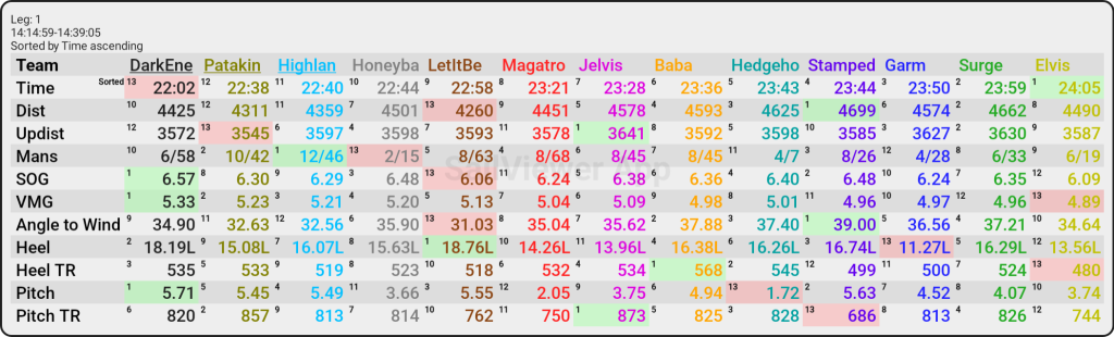
The data fields display the average values for the selected period. All wind-related values are calculated based on the fixed wind direction set for that time frame. The table is generally sorted by time, with the best-performing boats for that period appearing on the left side. In certain sections of the report, these values may only represent filtered straight-line sailing, excluding maneuvers and mark roundings. In such cases, the table is sorted by VMG (Velocity Made Good) to highlight the best-performing boats on the left side. The background of the lowest value is colored red, while the highest value is colored green.
There is also a small number showing the rank of that boat for each value.
Data Fields
Click on each for more info
Time – sailed time. On a leg, the boat with shoter time sailed the leg better.
Dist – toatl sailed distance over ground.
Updist – upwind distance sailed. When on a single leg, the boat with higher number has rounded the mark wider, went to unfavored gate mark or has started behind, making its own leg longer than it should be.
Mans – maneuvers and cumulative loss in all of them (losses are in upwind meters). Losses can be quite unreliable if sailing before or after the maneuver was not perfect.
SOG – speed over ground
VMG – VMG to the wind set. Note it is not the actual VMG to the wind since the wind direction and speed is not measured and used on each boat. On a stable wind day, it can be used as overall performance number. If shifty and gusty, it shows more who sailed shifts and gusts better.
ATW – angle to the set wind direction. In shifty wind, it usually shows who has sailed better shifts. In stable conditions, it shows the difference in the boat’s performances. The wind direction set for a leg is usually the average wind direction on that leg.
Heel – Heel of the boat (L – leeward, W – windward)
Heel TR – Represents the amount of heel movement in degrees per minute. A higher value indicates greater instability. This metric is only comparable between devices with the same logging frequency and damping algorithms.
Pitch – Shows the pitch of the boat. Pitch numbers are very different from boat to boat based on how they mount logging device. So once the 1st upwind straight line data is filtered, pitch is zeroed for all boats. So all further pitch numbers are that boat’s difference to what they had on the 1st upwind. Note that if you have device mounted on the mast, pitch also changes with the mast movement.
Pitch TR – Same as Heel travel, but for pitch.
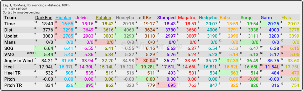
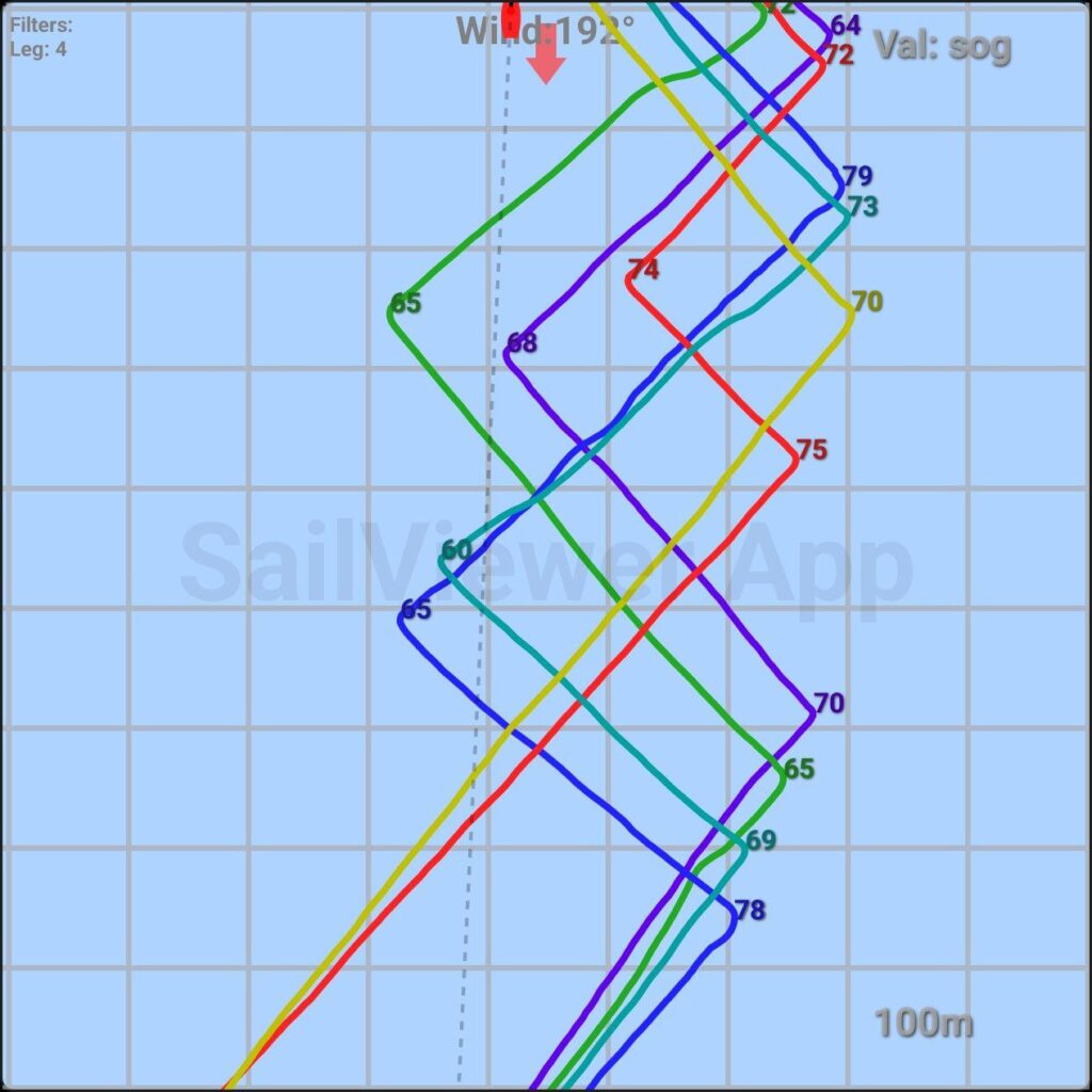
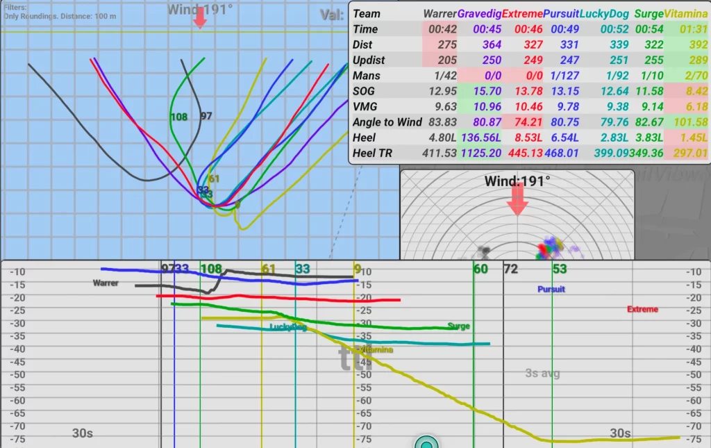
GPS Tracks
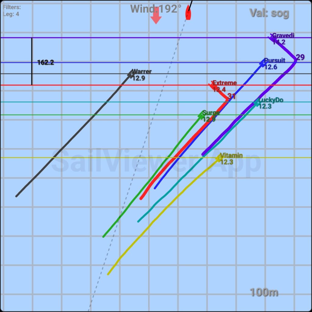
The GPS tracks display the positions and paths of the boats, with the wind always coming from the top of the screen. The wind direction is set based on the GPS tracks for that period. Horizontal lines indicate the current upwind position of each boat for easier comparison. If boats are highlighted, the upwind distance in meters will also be shown. The number next to each boat’s name represents its current speed which can be noticed by “Val:SOG” at the top right.
The GPS track is colored to highlight performance: the top 10% of sailing is shown in bright green, while the bottom 10% is in bright red. Green shades represent performance better than 50% of the time sailed, and red indicates worse performance. The path is primarily colored based on VMG (Velocity Made Good) relative to the set wind direction. If a different value is used for coloring, it will be specified on top left corner of the image.
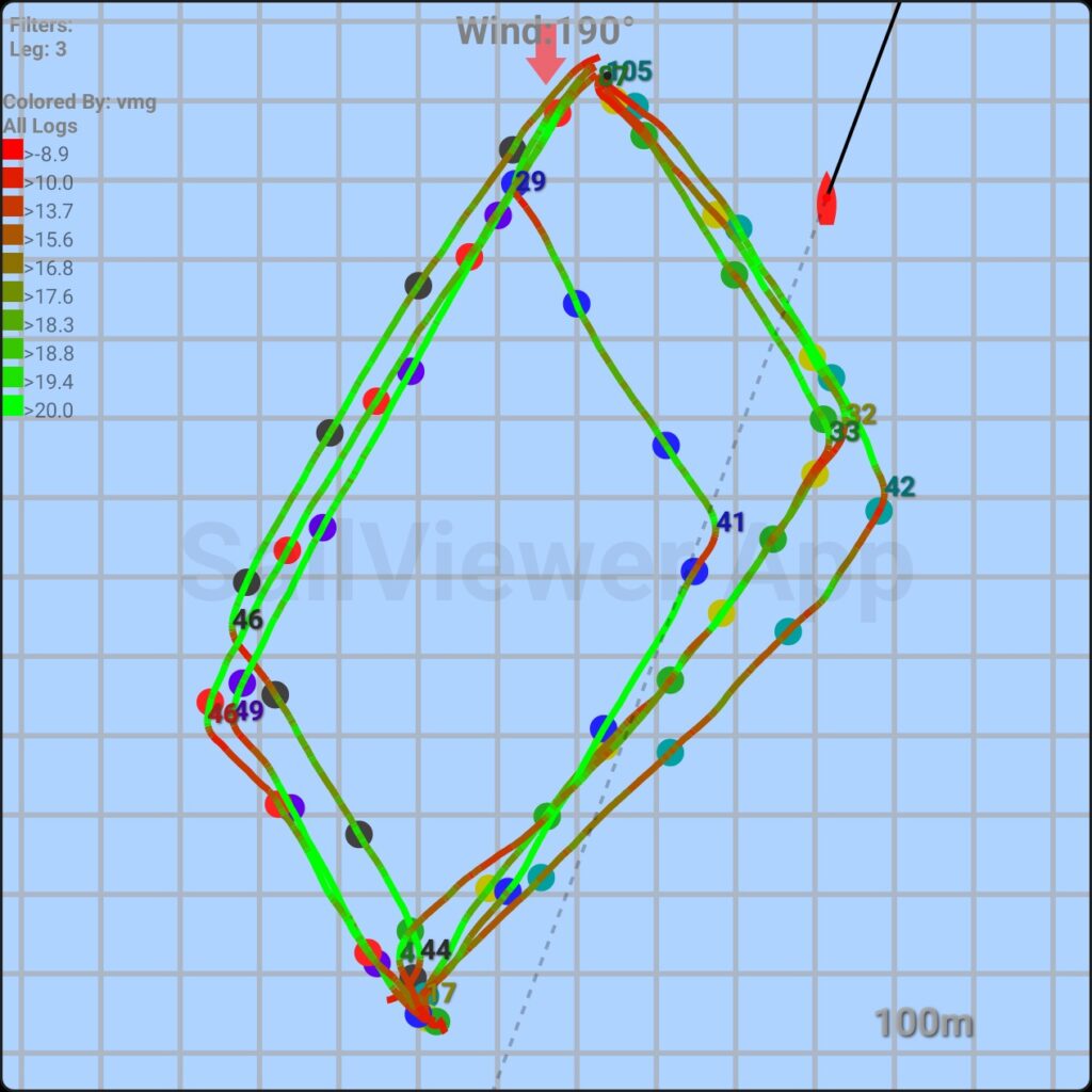
The race geometry shows the angle of the next mark relative to the wind direction. In this example, the mark is 10 degrees off, resulting in 1.72 times more sailing on the starboard tack. Laylines are also drawn based on the typical angle of the boats on that leg (33 degrees in this case).
Maneuver Performance
When not too many boats are racing, maneuver performance is calculated for each tack or gybe. The numbers displayed along the path can indicate either the upwind/downwind meters sailed during the maneuver or the maneuver loss.
• Upwind Meters: This value shows the upwind or downwind distance sailed during the maneuver. A higher number is better, making it easy to compare performance between boats.
• Maneuver Loss: This measures how many meters a boat loses by performing the maneuver, compared to not tacking. It calculates the VMG (Velocity Made Good) before and after the tack, and compares it to the VMG during the tack. However, this number can be less reliable due to the variability in conditions before and after each tack. For instance, if a boat was sailing slowly before the tack, the loss might even appear negative. Similarly, a boat performing better before and after the tack could show greater loss compared to a slower boat, even if their in-tack performance is similar.
The maneuver numbers also help in visualizing the data on the graph. Vertical lines in the Graph window represent maneuvers, and the numbers displayed above them correspond to those shown in the GPS path window.
Polar Graph
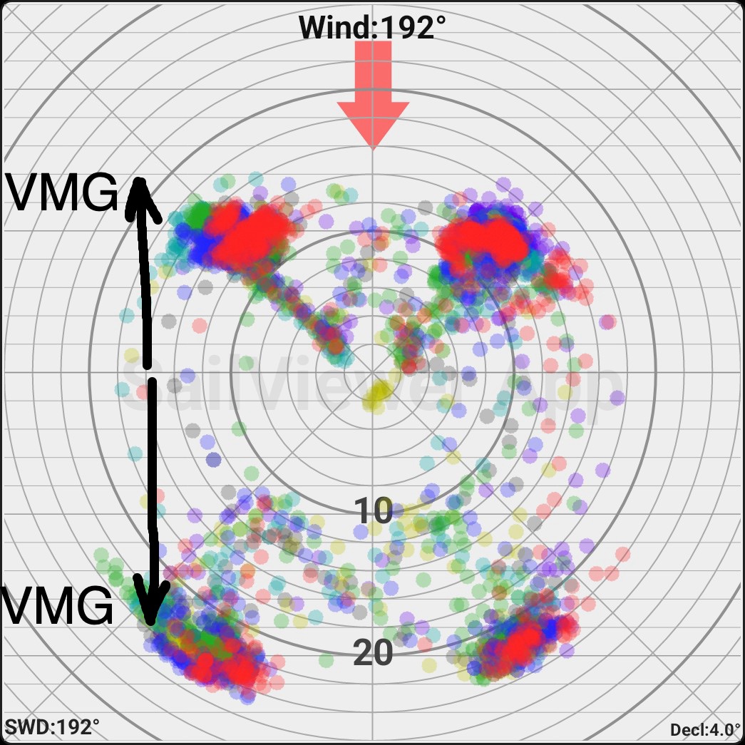
The polar Graph shows all the points of the selected period for all the boats. The wind always comes from the top. Each point is drawn at the angle and speed the boat had at that moment. The further from the center, the higher the speed. The VMG (Velocity Made Good) and performance is better the higher up the screen the dots are on the upwind and the lower they are on the downwind.
The example above shows the blue boat sailing at a low angle upwind on a starboard tack, resulting in a lower VMG.
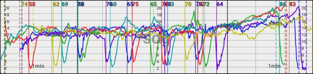
Graph Screen
Graph screen most of the time shows one of these values:
TTL (Time to Leader): This metric shows how many seconds earlier the leading boat was at a given point in the leg. TTL remains stable even at mark roundings but can increase or decrease with changes in wind speed.
DTL (Distance to Leader): This measures the distance, in meters, between a boat and the leader at a given time. The DTL can fluctuate significantly during mark roundings, especially if boats are sailing much faster upwind than downwind.
SWD – Suggested Wind Direction: The app analyzes the race and estimates the wind direction for each time interval based on the boats’ tracks. The accuracy of the wind direction improves with the number of boats participating in the race.
Dashed vertical lines are the mark roundings. Solid vertical lines are maneuvers (not shown below since there are too many so they are hidden)
Box Plot Data
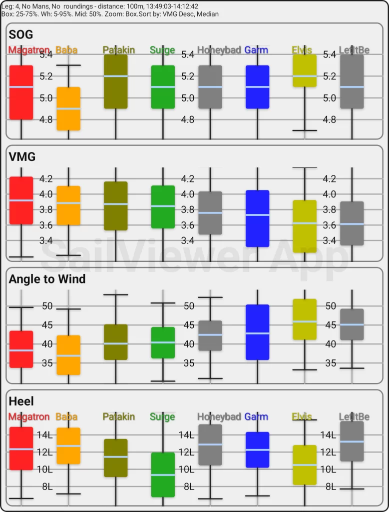
Box plot shows the values in a way where middle part of data is inside the box and 25% of data is on each side of it. Larger box means more instability of the value and bigger range. Additionally, black whiskers surround 90% of data, leaving only 5% on each side. Full data range is marked with gray whiskers. Line crossing the box is the median value, meaning half data is above and half below it.
Boat Screen
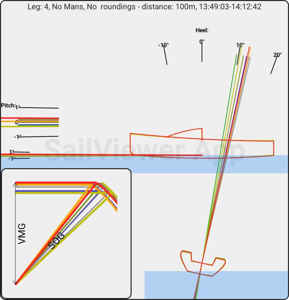
Boat screen shows the average pitch and heel of the boat. Above is explained how pitch numbers are handled when creating the reports. The VMG/SOG lines show average speed, angle and vmg sailed. The higer up the screen the better the VMG is. In this example we see the red boat having the best VMG, The orange one sailed the highest angle and the yellow one was the fastest, but performed bad due to the bad angles.
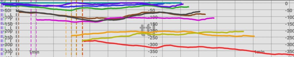
Mark Roundings
Mark roundings are typically shown with a GIF animation and a screen displaying data for the distance to and from the rounding point. All logs are aligned along the same upwind line, so boats rounding the favored mark cover fewer upwind meters. For example, in the illustration below, the black boat covered approximately 50 meters less upwind, indicating that the rounded mark was favored by 25 meters. Additionally, the black boat completed the 100 meters to and from the mark 12 seconds faster than the green boat. The DTL graph shows that the black boat overtook the blue boat by rounding the favored mark, while the blue boat was still sailing downwind.
The wind direction for mark rounding is generally determined based on the first few minutes of upwind sailing after the rounding.
GIF animations
GIF animations are generated for each leg of the race. When necessary, the upwind distance between two selected boats is also displayed. Additionally, animations are created for the start, including a countdown, and for mark roundings as needed.